ROLE
Product Design
TIMELINE
10 Weeks
TEAM
Ann Sunwoo (Design Supervisor)
Kang-Ting Peng (Front-end Developer)
Nolan Hill (Back-end Developer)
Pamela Horn (Cross-Platform Director)
Kirsten Sweeney (Accessibility Manager)
Nora Rueffer (Accessibility Intern)
TOOLS
Figma
Making the museum learning experience accessible for ESL visitors

Ever walked through a museum and found yourself confused by all the complex artsy terms? Me too!
During my ten-week internship at Cooper Hewitt Smithsonian Design Museum, I designed my intern project around language accessibility for ESL (English as a Second Language) visitors. Museum labels often use hard college-level English to maintain credibility, making exhibitions inaccessible for non-native English speakers. Even native speakers struggle with specific design terminology! The challenge was to create a solution that simplified the understanding of these terms without compromising the integrity of the content, ensuring that every visitor could fully engage with the exhibits regardless of language proficiency.
Outcome
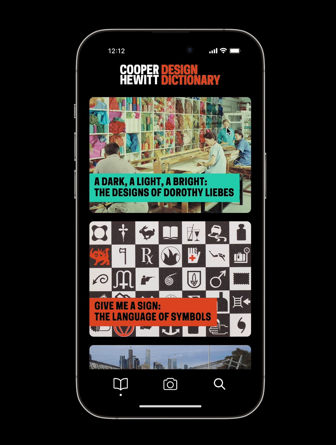
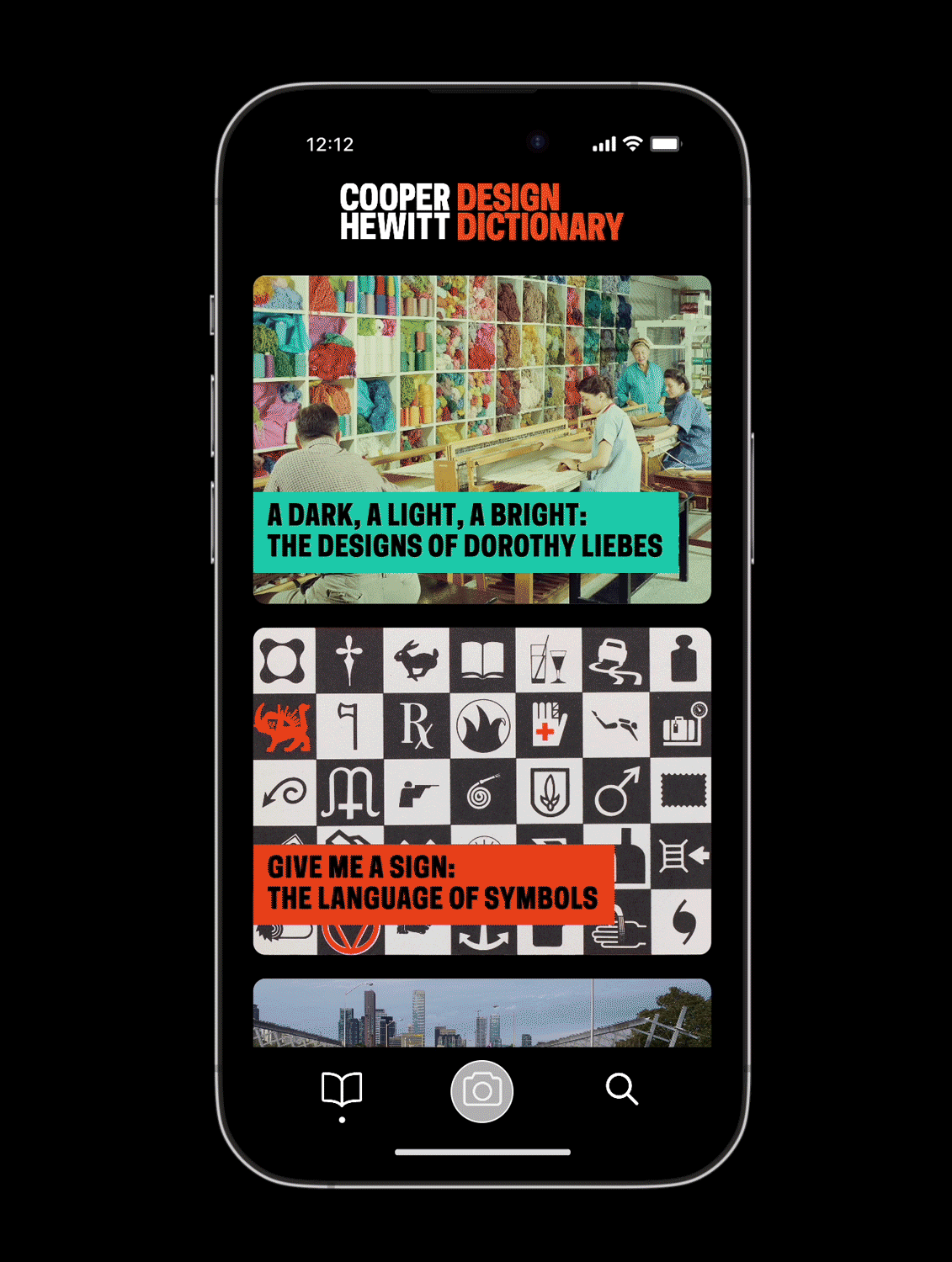
I developed and prototyped the Design Dictionary, allowing visitors to look up complex terms found on labels. Initially conceived as a mobile app, the solution pivoted to an integrated web-based tool, making it more accessible on-site and online.
Design Process
Initial Research & Ideation
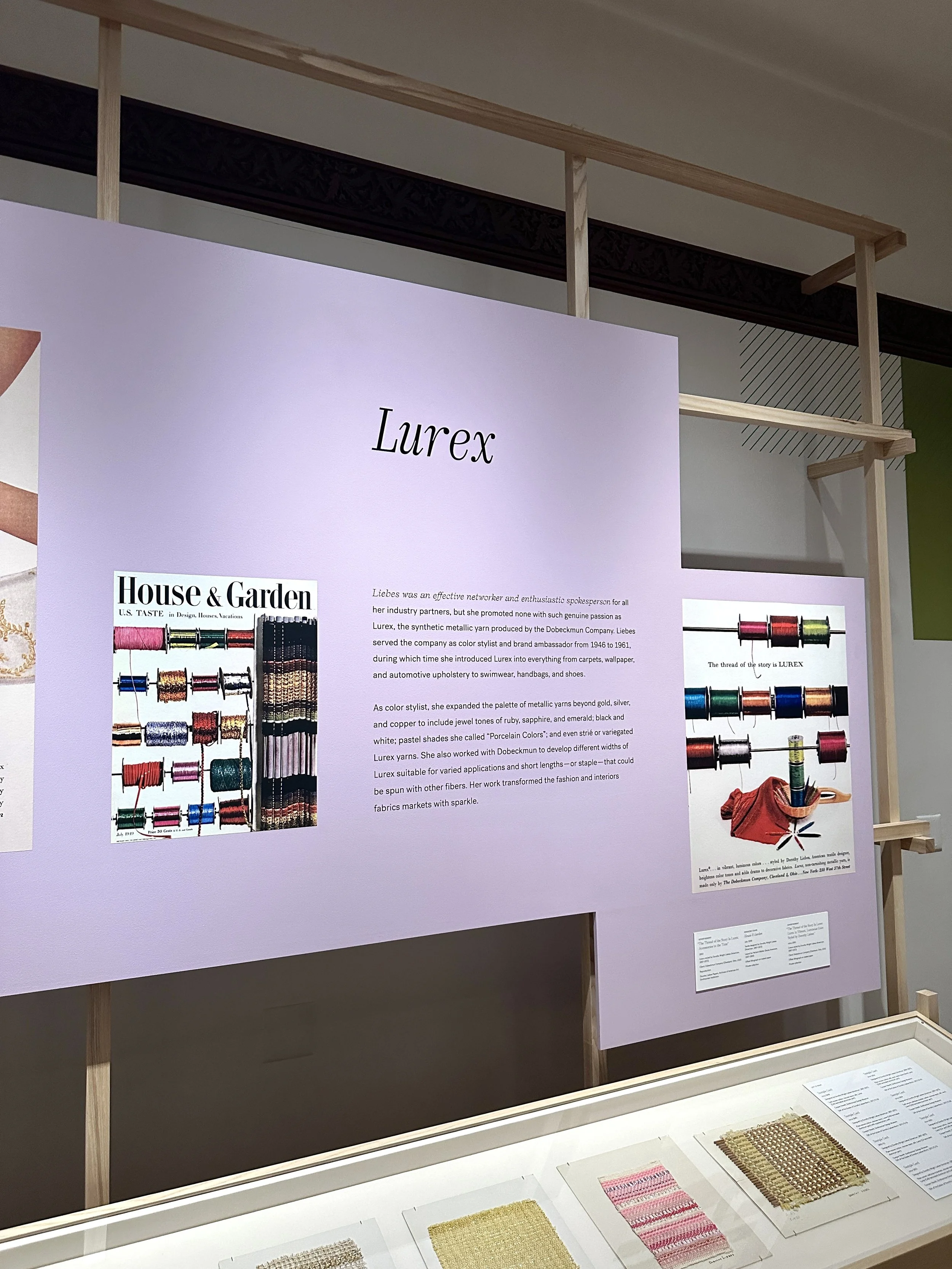
I began by collaborating with the Accessibility team to identify the specific pain points ESL visitors faced when navigating museum exhibits. We discovered that complex design terms like "warp," "weft," and "strié" were particularly challenging, even for native English speakers. Our goal was to create an accessible solution that would break down these terms into simpler language without detracting from the museum experience.


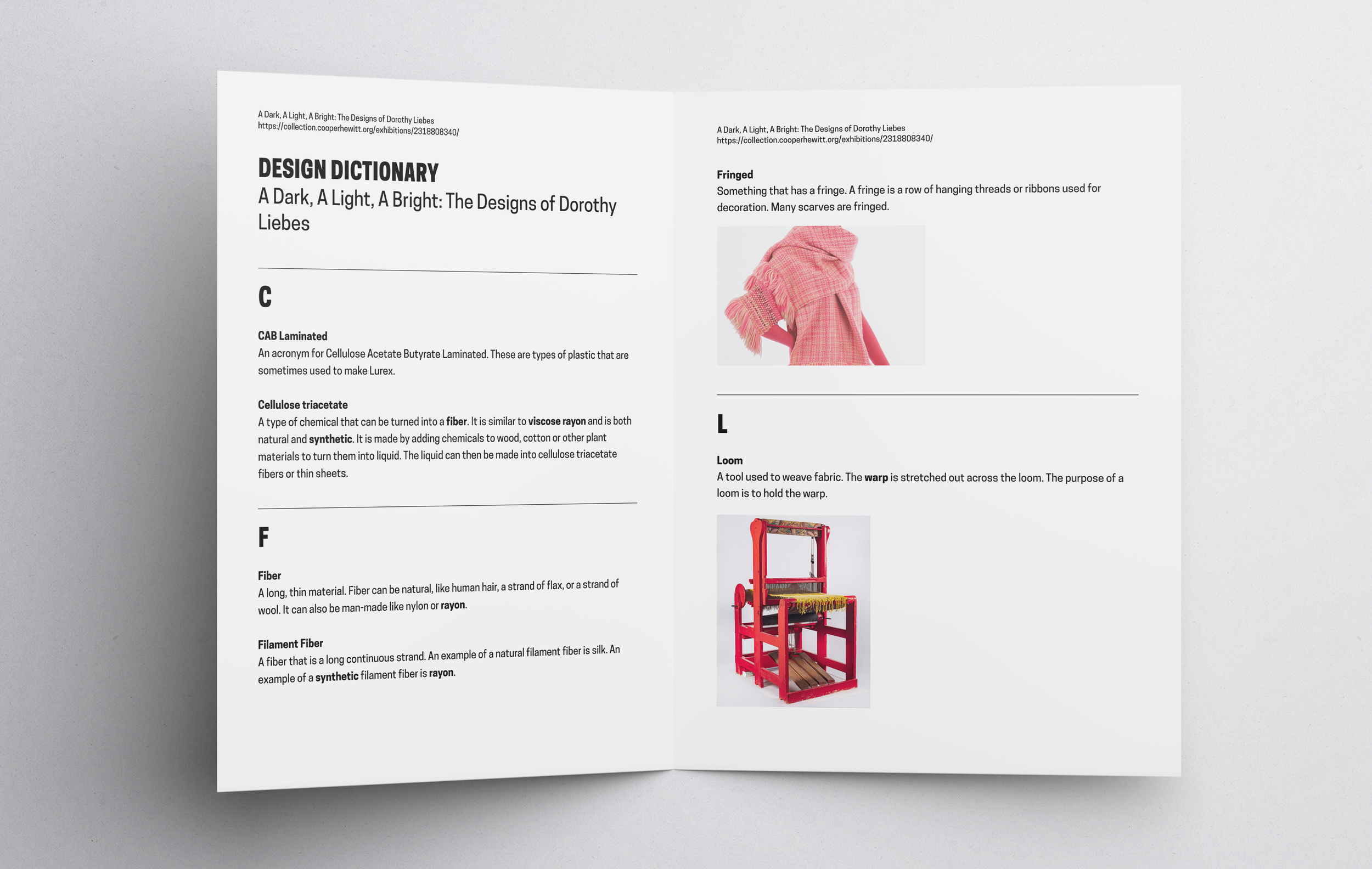
Working alongside my friend Nora (Accessibility Intern), I compiled a list of design terms from the Dorothy Liebes exhibition, pairing them with accessible, 8th-grade-level definitions (the standard for language accessibility). Initially, I designed a simple printed pamphlet for visitors to reference in the gallery space. While this worked as a proof of concept, it quickly became clear that a scalable digital solution would be more effective across multiple exhibitions.

Prototyping the Mobile App
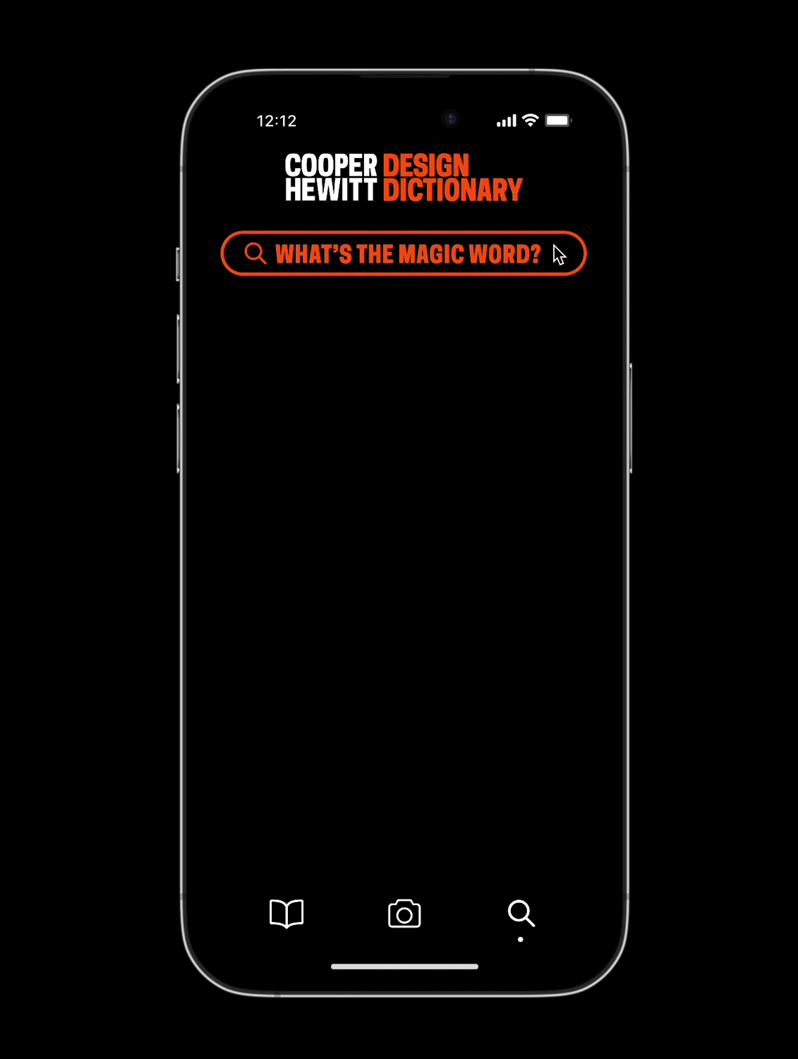
To expand on the initial idea, I used Figma to propose a mobile app that allowed visitors to explore design terms in three different ways. I ensured the UI was simple and intuitive, focusing on ease of use for non-native English speakers.
Room-Specific Glossaries: Visitors can select the exhibition and room are in to find relevant terms.
Camera Detection: Visitors can take a picture of an exhibition label, and the app would highlight any complex design terms, providing a definition with just one click.
Classic Search Bar: Users can search for design terms directly.
PIVOT!
After user testing with some museum visitors, we encountered two major issues:
Visitors felt that constantly interacting with their phones took away from the immersive museum experience.
Feedback from the Cross-Platform Director revealed that asking users to download a standalone app was impractical—many would be unwilling to do so for a short museum visit.
This feedback led to a significant pivot. I shifted focus away from the app and began working with the Development team to explore how the Design Dictionary could be integrated into the museum’s existing software infrastructure.
Introducing The Dictionary Busser
Rather than developing a separate app, I collaborated closely with the back-end and front-end developers to propose the creation of the Dictionary Busser, a system designed to work alongside the existing Table Busser. The Table Busser is already used by curators to input object details such as descriptions, dates, and materials for museum exhibits. Our goal was to make the process of adding accessible design term definitions more seamless by integrating the two systems, allowing curators and the Accessibility Manager to work together efficiently.
The proposed Dictionary Busser would allow curators and curatorial interns to input object descriptions as usual into the Table Busser and then switch directly to the Dictionary Busser to tag any complex design terms that needed simplified definitions. This would eliminate the need for creating a separate workflow or tab, ensuring the process remains streamlined. The Accessibility Manager would identify specific terms that needed to be defined, and the Dictionary Busser would store these terms, definitions, and images, making them accessible to visitors.
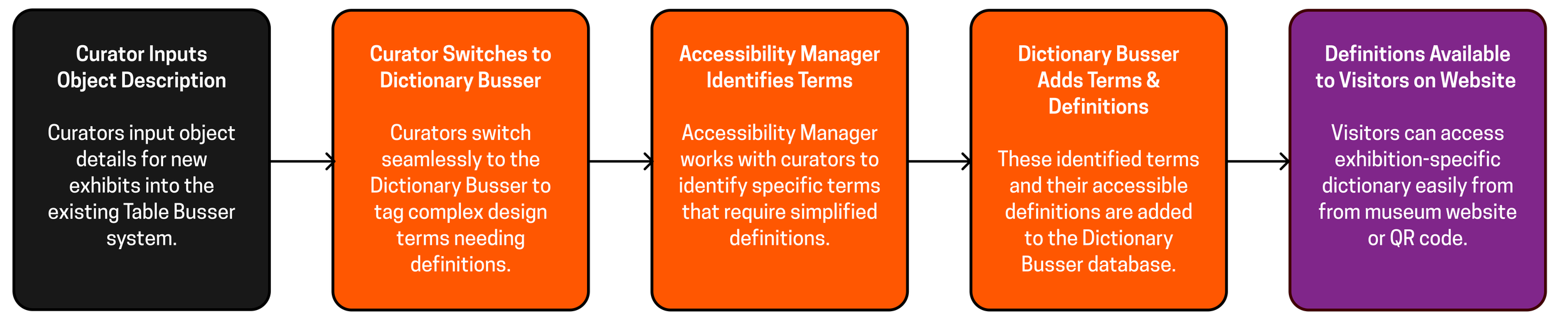
NEW WORKFLOW
Tab 1: View Exhibition Objects
Select an exhibition to see all its objects and descriptions. This allows curators and staff to identify descriptions that contain complex terms in need of tagging for accessible definitions.

Tab 2: Manage Definition Terms
Add new definition terms or edit existing ones, ensuring all complex design terms are accurately defined and available for tagging in the relevant object descriptions.

Throughout this process, there was a constant back-and-forth with the developers about what was technically feasible. For example, one of my initial ideas was to let users click on complex design terms (like "upholstery") within object descriptions on the museum’s website to access a definition page. However, I learned that the museum's online object descriptions couldn’t support this kind of clickable tagging. The system wasn’t built to allow individual words within descriptions to be linked to other pages, so I had to scrap this idea and focus on solutions that could be implemented within the existing framework.


not feasible!
On the Visitor’s End…
1. Downloadable Dictionary for On-View Exhibitions
Visitors can now access the Design Dictionary on the exhibition’s website. Under the "Prepare for Your Visit" section on the exhibition’s webpage, users can click "View and Print Design Dictionary" to view a mobile-friendly version. They can increase the font size for better readability, ensuring visual accessibility. This is modeled after an existing infrastructure—the large print labels—making the developers’ work more efficient.


For visitors who prefer not to use their phones during the museum experience, printed versions of the Design Dictionary will be available in the exhibition in large, easy-to-read font. This new system is both scalable and automated through the use of an API. In my first iteration, a designer would have had to manually create a definition sheet for each exhibition. Thanks to the integration of the Dictionary Busser and the API, the system automatically pulls definitions and updates them for complex terms. This streamlining makes it far more efficient for curators and the Accessibility team.
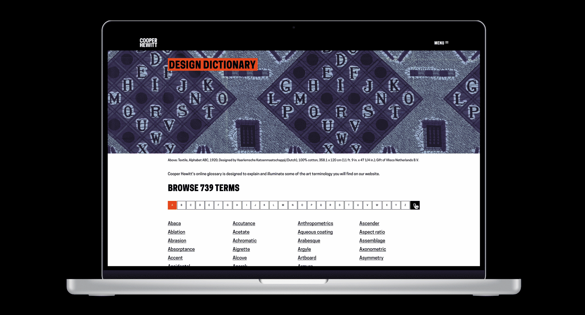
2. Design Dictionary on Cooper Hewitt Main Website
In addition to exhibition-specific dictionaries, I proposed a dedicated section on the Cooper Hewitt website that serves as an all-encompassing, A-to-Z Design Dictionary. This resource isn’t tied to any specific exhibition but provides a comprehensive list of design terms, categorized by letter, that visitors can explore at any time. This feature broadens the dictionary’s educational reach, making it accessible to anyone—whether they're visiting the museum or learning from home—offering valuable insights into design terminology for a global audience.
Feedback from Design and Cross-Platform Content Directors
The Design Director and Cross-Platform Content Director appreciated my efforts to explore different solutions, starting with a proof of concept and then shifting toward a more practical integration with the museum’s existing systems. They valued how I balanced creativity with feasibility to make the project more manageable for the team.
While they were hesitant about the all-encompassing dictionary idea due to the potential workload, they were enthusiastic about moving forward with the exhibit-specific Design Dictionary and the Dictionary Busser. They believe this will help with accessibility and are excited to begin integrating the solution into the museum’s workflow, aiming for a Summer 2024 launch.
A Selection of My Other Works for the Museum!


Takeaways🥡
This was my first time designing a UI/UX-based product for a company, and it was valuable to learn the value of creating solutions that are scalable and automated. By integrating the Design Dictionary into the museum’s existing systems, we streamlined the process of adding definitions without requiring manual design work for each new exhibition.
This internship emphasized again how important it is to consider how users engage with a product in real-life settings. While the initial app concept worked well functionally, it detracted from the immersive museum experience, prompting us to pivot to a more integrated, visitor-friendly solution.
Don’t be afraid to start big! Now and then, I psych myself out at the brainstorm stage and think about what’s feasible and what’s not even before testing my ideas. Starting with an ambitious vision allowed us to think broadly, but collaborating with developers and stakeholders helped refine it into something sustainable.
Flexibility was key in this project. By gathering feedback and iterating along the way, I could evolve the project into a solution that was both impactful and implementable, aligning with the museum’s long-term goals.
